Just a quick post now....card to follow later...but you might want to check out the blog candy over on Norma's Creations. She's celebrating her second blogaversary in style .
BFN

Thursday, 17 March 2011

Monday, 14 March 2011
Nice and CAS….
Following on from my disaster for last weeks challenge ("Ever get the feeling you missed the point"), I didn’t want to miss the “Less is More” challenge this week!! I’ve just finished my “Off the Edge” OLC.
Now, I know there is at least one of you out there that will think my 4-year old daughter coloured this (you know who you are) but I’m going to risk the ridicule 

I’ve used HobbyArts Town Scene-It stamps and coloured it in using chalks and my Stampin’ Up blender pen (I love it). I think the chalks really give a good texture to the colouring, and I also think the Balamory look is funky!
But don’t look too closely…you might see all the smudges
What do you reckon?
BFN.
When in doubt, get the Pink Petticoat out!
So every now and then, I get a request for a handmade card from one of my husband’s friends. It’s great that they consider a handmade card as a special thing for their ladies….but to put it bluntly, boys are so rubbish at telling you what they want!
This time however, I sent hubby armed with printouts of all my cards. His friend only had to pick on….and he did – a black and red themed Valentine Card. No problem. Colour scheme? “Exactly as it is in the picture”. Great! Seems straight forward.
However, by the time hubby’s got home to point at the required card, requirements had mellowed somewhat into “A card like that, but not that style and could you change the colours so it’s not so dark. He didn’t want to say anything ‘cos he didn’t want to be a bother”. *sigh*
So to the trusty Pink Petticoat papers and my interpretation of what is required


Let me know what you think

Thanks for reading.
Friday, 11 March 2011
Ever get the feeling you missed the point?
OK….now my new favourite blog at the moment is Less is More. I favour the simple, clean looking card and indeed, search through my gallery and I think you’d agree…..so did I get it right with this week’s challenge?

The theme this week is ‘Pastels’. This instantly put me in mind of Spring Wishes collection from Pink Petticoat! Easy! I created a lovely heart-shaped card, backed it with one of my favourite spring time papers in all its pastel-y beauty and finished it off with a topper from my lovely new Stampin’ Up stamps.
But as I stood back to view my creation, I’m thinking….card shape, busy background, ribbon and a border…..where’s the white space??
Alas, I am out of time so submit this card for your viewing. I still like it….it gave me a chance to use my new blender pen and chalks from Stampin’ Up to and the heart-shape is a good one for Mother’s Day, don’t you think?
You do you reckon?

TSK!
I thought the closing time was midnight! Missed it! Oh well….plenty of time to practice for the next one

The theme this week is ‘Pastels’. This instantly put me in mind of Spring Wishes collection from Pink Petticoat! Easy! I created a lovely heart-shaped card, backed it with one of my favourite spring time papers in all its pastel-y beauty and finished it off with a topper from my lovely new Stampin’ Up stamps.
But as I stood back to view my creation, I’m thinking….card shape, busy background, ribbon and a border…..where’s the white space??
Alas, I am out of time so submit this card for your viewing. I still like it….it gave me a chance to use my new blender pen and chalks from Stampin’ Up to and the heart-shape is a good one for Mother’s Day, don’t you think?
You do you reckon?
TSK!
I thought the closing time was midnight! Missed it! Oh well….plenty of time to practice for the next one
Tuesday, 1 March 2011
Another Mother’s Day Card….
I might have said this before, I’m not a cutesy kind of person….so why did I get more Fizzy Moon stamps? Well…because they make lovely Mother’s day cards when water coloured with distress inks, of course!
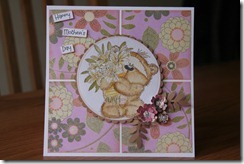
This card uses the new Desert Bloom papers. It’s such a simple but effective design and can be adapted to so many occasions. I’ll try and make some different occasions….but for inspiration on designs, hop over to CardPatterns.
Let me know what you think….thanks for reading

This card uses the new Desert Bloom papers. It’s such a simple but effective design and can be adapted to so many occasions. I’ll try and make some different occasions….but for inspiration on designs, hop over to CardPatterns.
Let me know what you think….thanks for reading
Subscribe to:
Posts (Atom)